|
|
Post by saltin on May 25, 2015 19:00:02 GMT -5
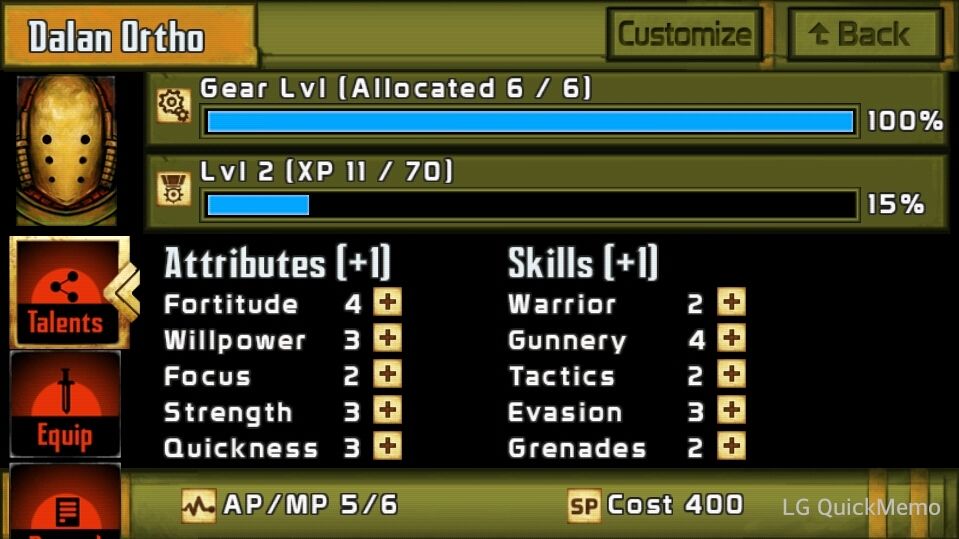
 Is this the xenos level up screen? Because real templars have fat fingers and cannot easily press the tiny little "+" buttons without the possibility of making a mistake  Joke aside, I am playing on a phone with a decent size screen and I can easily see myself pressing the wrong button by accident. More spacing is needed or an alternative a confirmation screen after making a selection. |
|
|
|
Post by CdrPlatypus on May 25, 2015 20:31:01 GMT -5
Seconded!
|
|
|
|
Post by Cory Trese on May 25, 2015 20:37:33 GMT -5
Looks like your entire screen has small screen support issues. We are working on improving the support for smaller screens.
|
|
|
|
Post by fallen on May 25, 2015 20:57:29 GMT -5
Thanks, added to the lists.
|
|
|
|
Post by En1gma on May 25, 2015 21:44:30 GMT -5
Small on HTC One as well.
|
|
|
|
Post by Cory Trese on May 25, 2015 23:52:12 GMT -5
Small on HTC One as well. Interesting -- that is the device we use to test and design the touchscreen stuff. We all carry HTC One M8 as our daily devices and I've played more on that phone than on my desktop (which is saying a lot, considering how many hours I have logged.) |
|
|
|
Post by johndramey on May 26, 2015 2:21:51 GMT -5
Also, and this isn't related to the size at all, would it be possible to have a system similar to HoS where we have to confirm our skill distribution? I've fat fingered my SP on a couple of occasions and it was a little frustrating not being able to undo them easily.
|
|
|
|
Post by beuns on May 26, 2015 3:09:35 GMT -5
I'm playing on HTC One mini 2 and I also see the size issue. Maybe a -/+ button can fix the problem.
Beside, I think a minimal info on what a skill/attribute does could help decide pick one. As a player of TA I know which one I want for my character but a new player can be confused...
|
|
|
|
Post by fallen on May 26, 2015 9:52:03 GMT -5
I'm playing on HTC One mini 2 and I also see the size issue. Maybe a -/+ button can fix the problem. Beside, I think a minimal info on what a skill/attribute does could help decide pick one. As a player of TA I know which one I want for my character but a new player can be confused... We could add a link to the Library from this screen? To all - size issue noted, on our list to be addressed. |
|
|
|
Post by dayan on May 26, 2015 12:49:53 GMT -5
I'm playing on HTC One mini 2 and I also see the size issue. Maybe a -/+ button can fix the problem. Beside, I think a minimal info on what a skill/attribute does could help decide pick one. As a player of TA I know which one I want for my character but a new player can be confused... True. Even with TA, Gunnery, Warrior, Speed are easy enough to understand. But its hard to spend points into attributes with which you don't know how they affect the character. |
|
|
|
Post by beuns on May 26, 2015 12:56:23 GMT -5
A link to the library could be helpful.
Maybe a quick description (like the one in ST RPG) with a long press/mouse over ? (I know it's not possible now but in the future ?)
|
|
|
|
Post by slayernz on May 27, 2015 1:06:35 GMT -5
Oh oh ... found this an issue with a Galaxy S4 too ...
really really small buttons to press.
I'll remove my duplicate post (put in the bugs section)
|
|
|
|
Post by khearn on May 27, 2015 21:03:19 GMT -5
Yeah, I'm afraid I'm going to fat-finger those tiny buttons every time on my MotoX, which has a fairly medium screen for a phone. So far I haven't, but it's just a matter of time. But the problem is that there isn't much room for bigger buttons without having to make things so big that you have to scroll to see everything. And when you're not leveling up, it's nice to be able to see all the attributes/skills at once.
Who said game designing was easy?
|
|
|
|
Post by Cory Trese on May 27, 2015 23:42:28 GMT -5
Yeah, really don't want to have to move it to a scrolling page.
|
|
|
|
Post by slayernz on May 28, 2015 0:06:03 GMT -5
Can you make it zoom in on click?
|
|