|
|
Post by elwoodps on Nov 9, 2015 13:17:14 GMT -5
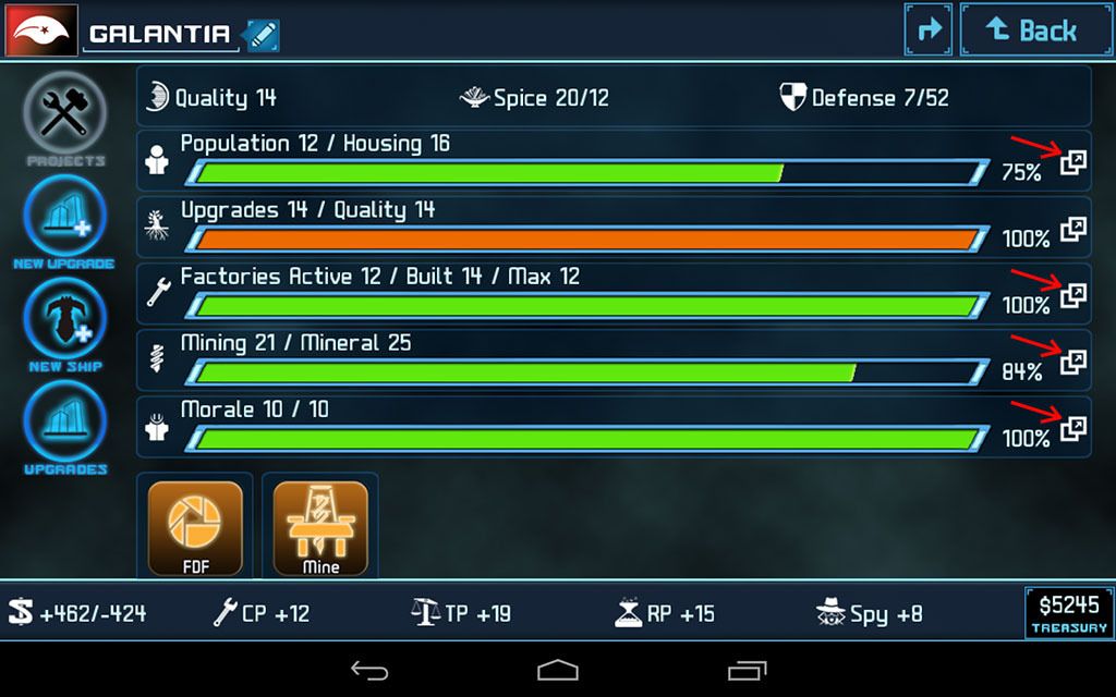
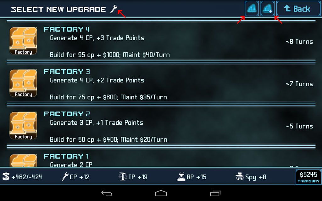
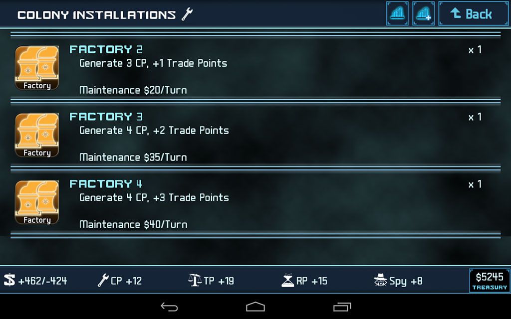
I really appreciate the buttons that you recently added to the main Colony screen that open NEW UPGRADE screens filtered by upgrade type (Population, Factory, Mining or Morale). There are however additional improvements to these filtered Upgrade screens that I hope you'll consider making.  On the left side, put an icon (in this example the Factory Upgrades screen), indicating which list you're in (not terribly important, but easy to do). More significantly, on the right side add 2 new buttons that take you back and forth between this screen.....  ..... and another screen that displays a list of existing installations filtered the same way.  This would allow the player to weigh the new upgrade vs upgrade an existing installation options and implement the decision, with a lot less tapping and scrolling than it currently takes. |
|
|
|
Post by fallen on Nov 9, 2015 18:07:53 GMT -5
Thanks for the feedback! We'll take a look at these changes.
|
|
|
|
Post by elwoodps on Nov 10, 2015 6:45:04 GMT -5
Thanks.  |
|
|
|
Post by fallen on Nov 10, 2015 9:36:09 GMT -5
#4X-3212
|
|
|
|
Post by Cory Trese on Nov 4, 2016 11:23:22 GMT -5
This is one of the bummers of Proboards not having good image hosting. I came back to work on this today and the Photobucket images are gone.
|
|
|
|
Post by ntsheep on Nov 4, 2016 11:45:33 GMT -5
I think we should blame that guy that posted his photo on page 98 of the torp thread. That's when we ran out of space for uploading images here. Yeah it's his fault. Let's get him! We'll tar and feather him! Then shear him bald! We'll,,,,,
Number 3 what the hell are you typing this time!
PLEASE WAIT WHILE THE DIGI-SHEEP SYSTEM RESOLVES AN IRQ CONFLICT.
|
|
|
|
Post by Cory Trese on Nov 6, 2016 17:37:23 GMT -5
Image are back, work will resume  |
|