|
|
Post by elwoodps on Jan 5, 2016 11:50:31 GMT -5
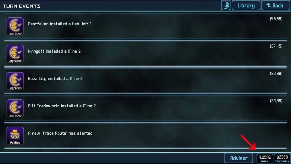
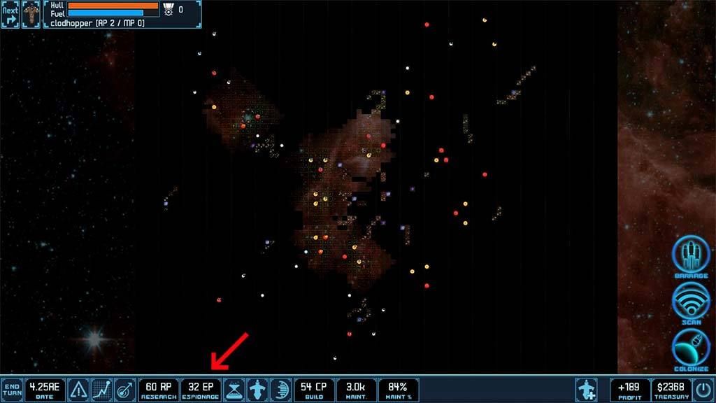
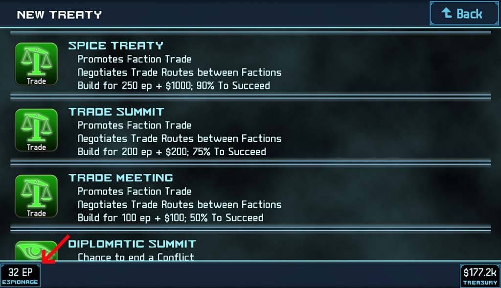
1) Add a Date display to the TURN EVENTS screen.  This would be really nice when saving screenshots to document important events in a game, like Cory Trese did in the Shared Game #1 - Degla, Normal [Turn Reports] thread yesterday. Also while looking at Cory Trese 's screenshots I noticed that the Steam version has an EP display at the bottom of the main screen, which the Android version understandably doesn't have (almost certainly due to lack of space on the smaller Android screens).  Which brings me to my second suggestion: 2) Add an EP display to the NEW TREATYS screen.  This screen is a most helpful place to have that particular bit of information when deciding which particular treaty to run next, and especially when deciding if there's any benefit to paying the double cost to subsidize a treaty. A good example of this is deciding whether to subsidize a Trade Meeting. If your economy is producing anywhere between 50 and 62 EP/turn there's no benefit to subsidizing; it's going to take two turns to run the treaty whether you subsidize it or not. |
|
|
|
Post by Cory Trese on Jan 5, 2016 12:13:55 GMT -5
ok, will do. great suggestions.
|
|
|
|
Post by Cory Trese on Jan 5, 2016 12:14:53 GMT -5
Ticket #3227 (new enhancement)
4X - RFE - Additional Data Display Fields (Easy)
|
|
|
|
Post by elwoodps on Jan 5, 2016 15:40:58 GMT -5
Thanks!  |
|
|
|
Post by eriptron on Jan 29, 2016 23:36:48 GMT -5
Could I please request adding to the list adding to the All Colony display each colonies current Factory count as well as the Maximum that can be built?
|
|
|
|
Post by fallen on Jan 30, 2016 0:22:54 GMT -5
eriptron - great request. It is on our list to improve the details shown on that list, so we've taken this note.
|
|
|
|
Post by acecow on Feb 7, 2016 14:20:47 GMT -5
Actually, is there any reason you have to remove the bottom bat when switching between most overview screens? The info bar for the main play screen has almost all the info you need (date, income, RP, CP, all its missing is ep), and would be beneficial to keep on almost every screen.
Sorry if its been talked about before and I missed it though.
|
|
|
|
Post by fallen on Feb 7, 2016 16:14:44 GMT -5
Actually, is there any reason you have to remove the bottom bat when switching between most overview screens? The info bar for the main play screen has almost all the info you need (date, income, RP, CP, all its missing is ep), and would be beneficial to keep on almost every screen. Sorry if its been talked about before and I missed it though. Which bottom bar are you talking about? |
|
|
|
Post by acecow on Feb 7, 2016 19:55:49 GMT -5
Actually, is there any reason you have to remove the bottom bat when switching between most overview screens? The info bar for the main play screen has almost all the info you need (date, income, RP, CP, all its missing is ep), and would be beneficial to keep on almost every screen. Sorry if its been talked about before and I missed it though. Which bottom bar are you talking about? The info bar you see when you're in the galaxy or main view (coming from Android version). Why not simply keep the same bar for every screen instead of having "different" ones which only show limited data? |
|
|
|
Post by fallen on Feb 8, 2016 11:31:04 GMT -5
acecow - because, often, that information is specific to the screen at hand. For example, in the Colony Details screen, you're seeing numbers that are specific to that colony and only that colony.
|
|
acecow
Curator
  [ * ]
[ * ]
Posts: 65 
|
Post by acecow on Feb 8, 2016 15:43:08 GMT -5
acecow - because, often, that information is specific to the screen at hand. For example, in the Colony Details screen, you're seeing numbers that are specific to that colony and only that colony. True, fair enough on that one. I think my biggest concern or focus was at the Turn Events screen? Often times, when you're flooded with various events it's nice to see what your empire is producing so you can make a mental checklist of "this planet needs to build this next" because EP or RP or income is low and you can see from the Turn Events screen which colonies just finished building. I realize I can also do this from the idle coloies button, however that's an extra two taps versus the Turn Events screen which I'll see almost every turn for zero/one tap. I suppose my biggest question was, why not keep the info bar native to as many pages as possible? But I suppose the answer is to prevent information overload? |
|
|
|
Post by Cory Trese on Feb 8, 2016 15:58:13 GMT -5
Prevent information overload, make sure the player knows what the relevant numbers are without making them sort through irrelevant info.
|
|