|
|
Post by fallen on Feb 19, 2016 20:29:29 GMT -5
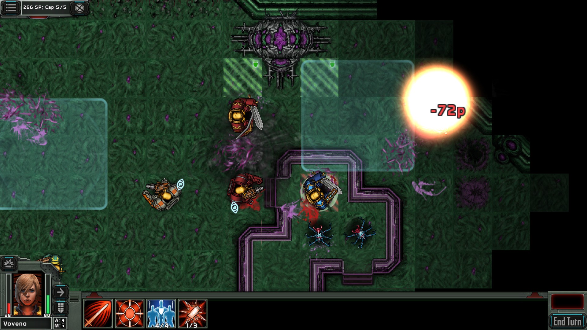
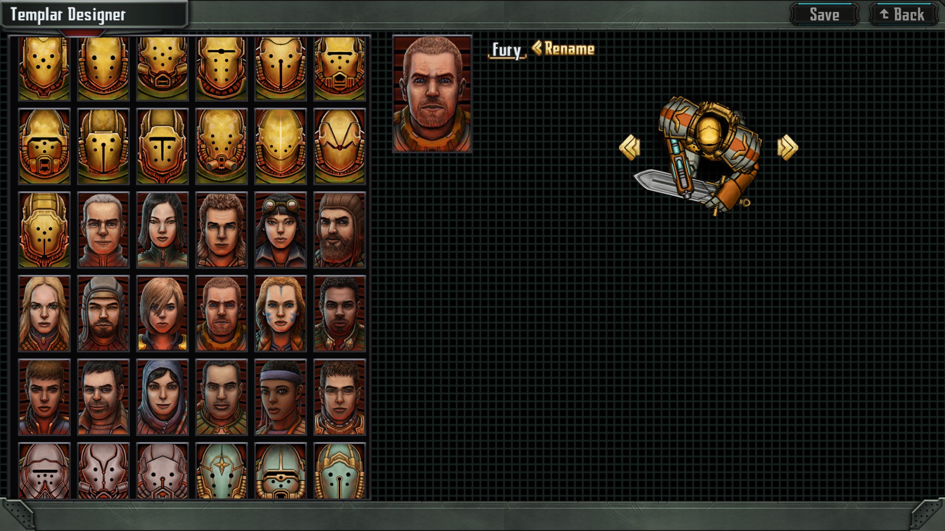
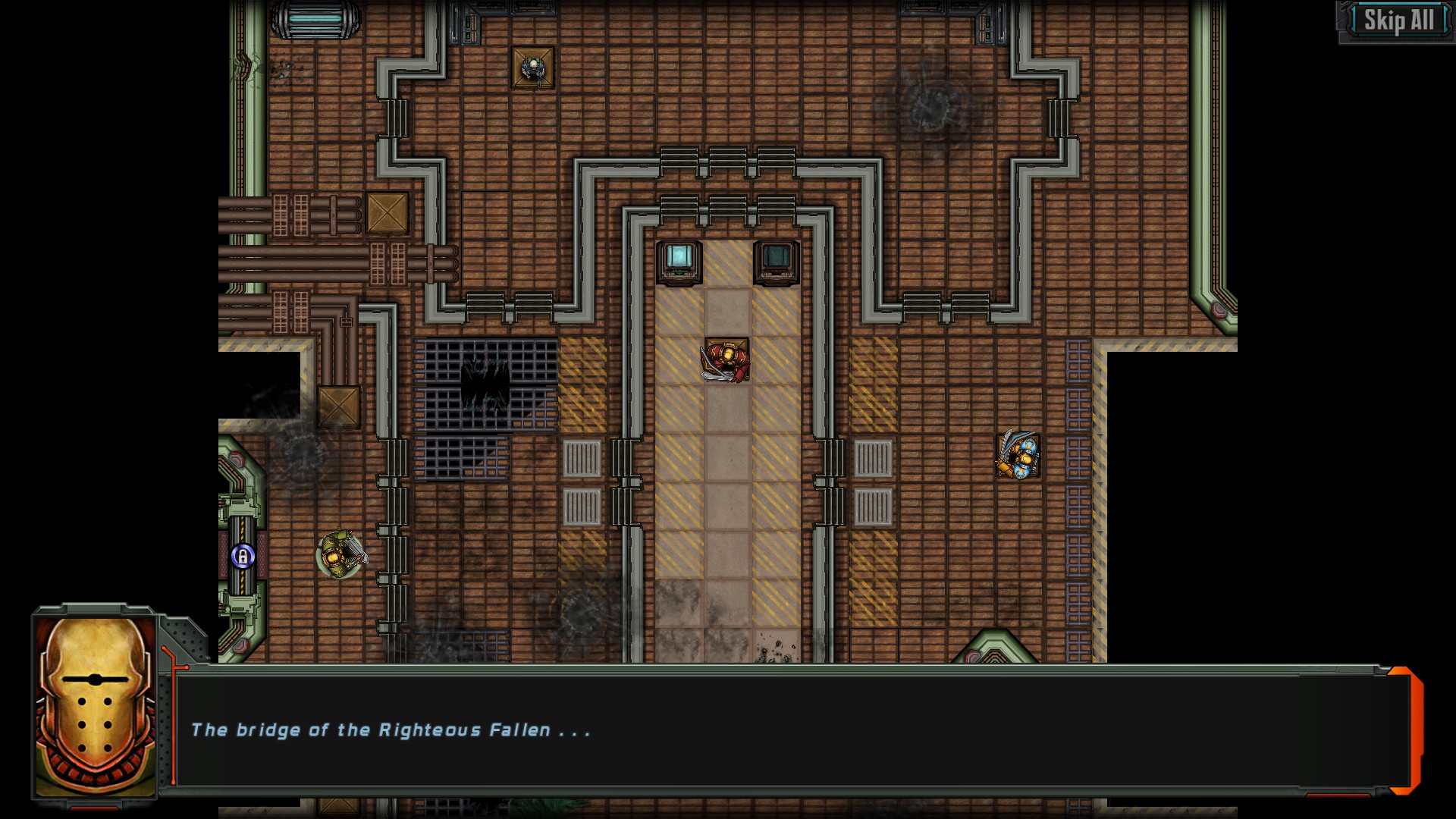
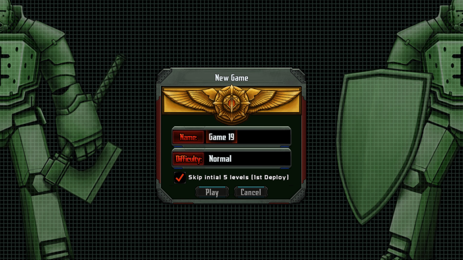
 With the 22nd major update to Steam, we've completed a major art upgrade for the game's entire UI. Almost every screen and element has been improved with an all new, cohesive look.   We've also taken this chance to inject some higher res versions of the character's faces into the game as well, in the story dialogs and the designer.  Finally, we've packed a few more tidbits of information into the hovers on enemies, Templars, and Tact Points to make sure the most important details are readily available. Now that we've finished a visual overhaul of the UI, we're going to be getting back to some improvements in the behaviors and screen transitions that were on hold while we finished this big project.  We hope you like the new look! Thanks to everyone supporting the game with reviews, shares, and by telling a friend!v2.0.1 - 2/19/2016 - Major UI overhaul, all UI elements improved - Improved use of character faces, added HD faces to dialog and designer - Added more fields to mouse hover on enemies, Templars and Tact Points - Fixed Reported Crashes |
|
|
|
Post by wascalwywabbit on Feb 19, 2016 21:09:16 GMT -5
Looks super polished!
|
|
|
|
Post by fallen on Feb 19, 2016 21:14:02 GMT -5
Thanks, it's been a long time in the making but very pleased with the results! |
|
|
|
Post by Brutus Aurelius on Feb 19, 2016 21:14:22 GMT -5
Looks amazing!
|
|
|
|
Post by fallen on Feb 19, 2016 21:25:35 GMT -5
Coming to a mobile near you  |
|
|
|
Post by CdrPlatypus on Feb 20, 2016 0:49:11 GMT -5
Wow! Come a long way from alpha
|
|
|
|
Post by En1gma on Feb 20, 2016 7:49:31 GMT -5
Would the Templars look too granulated if you made them larger in the designer? I would love to see them take up some of that unused space, but only if it would still look good  |
|
|
|
Post by Cory Trese on Feb 20, 2016 10:51:58 GMT -5
Glad everyone likes it so far!
|
|
|
|
Post by fallen on Feb 20, 2016 10:59:09 GMT -5
Would the Templars look too granulated if you made them larger in the designer? I would love to see them take up some of that unused space, but only if it would still look good  Possible. I can add it to our list, but it's low priority compared to other follow up changes. |
|
|
|
Post by johndramey on Feb 21, 2016 20:19:15 GMT -5
Looks really, really great. Can't wait to see it on my phone, as that is where I do 100% of my playing these days.
|
|
|
|
Post by fallen on Feb 21, 2016 20:43:52 GMT -5
Looks really, really great. Can't wait to see it on my phone, as that is where I do 100% of my playing these days. Should have been available a while ago now. For mobile, we've got a patch coming to fix issues with the new game screen and the exact positioning and size of the Talents scroller. |
|
|
|
Post by johndramey on Feb 21, 2016 20:45:48 GMT -5
Well then good deal! I haven't gotten a chance to get BF up and running since last Friday, so I'll check it out ASAP.
|
|
E-man
Curator
  [ Patreon & Star Traders 2 Supporter]
Posts: 25 
|
Post by E-man on Feb 22, 2016 17:51:00 GMT -5
Hadn't played for a while. Loaded up TBF over the weekend and noticed this beautiful UI. Just wanted to stop by and say great job! Looks fantastic!
|
|
|
|
Post by fallen on Feb 22, 2016 18:04:03 GMT -5
Hadn't played for a while. Loaded up TBF over the weekend and noticed this beautiful UI. Just wanted to stop by and say great job! Looks fantastic! Thank you very much for the compliments. I hope you'll update your review on your market  |
|
E-man
Curator
  [ Patreon & Star Traders 2 Supporter]
Posts: 25 
|
Post by E-man on Feb 22, 2016 18:24:28 GMT -5
Done  |
|