|
|
Post by progor on Feb 17, 2019 2:18:24 GMT -5
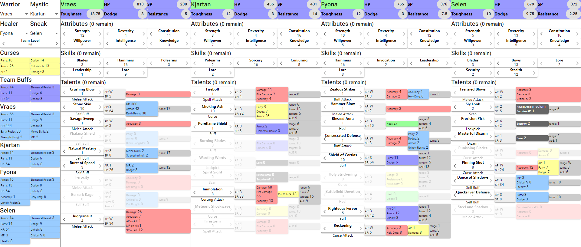
 Make your own team build at any level: dpwhittaker.github.io/hos-planner/This project has been sitting around on my hard drive in various states of completion for about 2 years now, so in light of the imminent release of the End Game, I wanted to publish it for the rest of the community. If you're anything like me, you enjoy the theorycraft behind the game just as much (heh, sometimes more) as the game itself. This app lets you experiment with builds "on paper" before you commit a save to them in game. It's purely browser based, and updates its URL every time you make a change, so if you find a build you want to keep or share, just bookmark it or copy the URL and send it. If you make changes to your bookmarked build, don't forget to update your bookmark! Some caveats: it keeps you from increasing your skills, attributes, or talents above what your current level will support, but if you then decrease the level, your remaining skills, attributes, and talents may go negative. It's up to you to make sure the (XX remain) at each section header is 0 to ensure the build is finished for the currently selected level. I've checked all of the talent values against the in-game descriptions at least once, but the HP, SP, Toughness, Dodge, Resistance values were done over a year ago, and I'm not sure if there are any changes in those calculations since then (or where to look if there are). Some data may still be missing or incorrect - please let me know if you spot anything. Instructions: You can change which hero is in each slot with the dropdowns in the top of the left panel. Just below that is where you set your team's level. The Attributes, Skills, and Talents each have left/right arrows to decrease/increase the value. Even if a talent is grayed out, that just means it has 0 points on it (I wanted those to fade into the background and make it easier to see what you had actually invested points in). You can still click the right arrow to add a point to it, which will make it light up like the rest of the talents. Beyond that, everything else on the page is calculated. The left panel shows the consolidated list of team buffs, as well as the total buffs each character (team + self), assuming all buffs are cast, including buff attacks. You can also see the maximum amount of cursing that you could put on a single enemy - useful for making sure you have enough AP stripping, for instance. Color codes: light gray: talent cost red: attack light blue: self buff blue: team buff green: heal yellow: curse dark gray: security/stealth medium gray: extra info These make it easy to identify at a glance an attack buff (has a red and light blue box), etc. AoE number: the number of squares in the AoE area (i.e. a cross is 5 squares, a 3x3 box is 9 squares, etc.). Thankfully the different shapes still have a unique number of boxes in them, so it works out. If this is a point of confusion, I'll work on adding icons when I get another few hours of free time (hopefully not 2 more years from now  . |
|
|
|
Post by havnor on Feb 17, 2019 5:41:16 GMT -5
|
|
|
|
Post by fallen on Feb 17, 2019 13:06:52 GMT -5
+1 +1 +1 This is really amazing  |
|
|
|
Post by fallen on Feb 17, 2019 13:10:15 GMT -5
|
|
|
|
Post by progor on Feb 17, 2019 13:33:04 GMT -5
Yes, credit where credit is due, John Robinson's talent tables were my initial inspiration when I started this project. The first version of the data file was sourced from his excellent work.
|
|
|
|
Post by anrdaemon on Feb 17, 2019 14:53:04 GMT -5
There's a problem with .jss50 style.
It causes persistent horizontal scrollbar and twitching vertical scrollbar in edge cases.
Should probably have been
width: calc(100%-8px); margin: auto;
|
|
|
|
Post by progor on Feb 17, 2019 15:37:52 GMT -5
Thanks, I'll get that fix in tonight hopefully, along with better overall support for mid-size screens. I focused on 1080p landscape, and phone portrait during development.
|
|
|
|
Post by John Robinson on Feb 17, 2019 19:25:02 GMT -5
Yes, credit where credit is due, John Robinson's talent tables were my initial inspiration when I started this project. The first version of the data file was sourced from his excellent work. Wow! Well done. I've been concentrating on STF and haven't updated HOS since 1/18/17 v4.2.77 I'm nuts about using color codes. Entire thing not only allows easy team planning but tutors players at the same time. +1 karma and enjoy your "badge of awesome deed" Note to readers: Don't forget to hit the exalt button for progor karma Thanks for the honorable mention  fallen fallen This guy is holding a royal flush in creativity! Thanks for pointing it out. |
|
|
|
Post by fallen on Feb 17, 2019 23:28:53 GMT -5
John Robinson - as soon as I saw it, I thought of you  I'm hitting +1 for progor as often as I can lol
|
|
|
|
Post by anrdaemon on Feb 18, 2019 7:54:54 GMT -5
Thanks, I'll get that fix in tonight hopefully, along with better overall support for mid-size screens. I focused on 1080p landscape, and phone portrait during development. This will be a problem on any size of screen. The blocks stack is going 100% > 100% > 100% > 100%+8px (wat?) |
|
|
|
Post by progor on Feb 18, 2019 13:09:14 GMT -5
Yeah, turns out that was a bug in material-ui's Grid spacing implementation. I ended up just removing the spacing to make it scale down to smaller screens better. Now it will remain full screen down to 720p, then add a horizontal scrollbar on the individual heroes down to 600 width, then switch over to the tabbed mobile view. Hopefully this should give everyone a nice experience regardless of your screen size.
|
|
|
|
Post by fallen on Feb 18, 2019 13:57:03 GMT -5
Lovely new screenshot  |
|
|
|
Post by progor on Feb 21, 2019 1:15:35 GMT -5
New update today: made the links much shorter and less ugly, added a little bit of breathing room between the boxes so they don't fall on top of each other, and rearranged the info boxes so that cursing attacks and the like are not so squished. I also put the attributes and skills in an accordion so they are hidden unless you want to look at them. Here's a new example link: dpwhittaker.github.io/hos-planner/#VVFT45-74653333312111aa1360-44446631332116a25710-54555432237110a400a-565444132331111a9a00The first section after the # makes it easy to tell what team and level the build is at a glance. The rest is just the attributes, skills, and talents for each character in the order they show up on the screen in base 36 (so they are always one digit numbers). This makes the hash about 90 characters long instead of ~1000. The old links should still work, but will convert to the new format if you change anything. Next up: I'll be going back through the Combat Mechanics guide and seeing if there are more heavily build-related (not gear dependent) stats to pull out. Maybe die counts. |
|
|
|
Post by Cory Trese on Feb 21, 2019 13:57:39 GMT -5
i adore you for making this
|
|
|
|
Post by fallen on Feb 21, 2019 15:03:23 GMT -5
That karma just keeps rising  |
|

 .
.


