|
|
Post by fallen on Oct 13, 2015 13:50:10 GMT -5
Thanks, we'll keep working to improve.
|
|
|
|
Post by anrdaemon on Oct 13, 2015 15:43:45 GMT -5
You are aware that cancelling a talent is as simple as re-pressing on it, right? Yes, I'm aware. Doesn't help even a little, especially not, if it isn't on screen right now. the point is, the new UI behavior is distracting. Talents that constantly peering at you, the info button disconnected from the talents and not doing anything all the other time (or even worse - doing an unrelated action of switching to the next character in stats screen). Distracting arrows… Well, I'd better stop now, I really don't want to use strong language. These guys are nice and deserve praise. |
|
|
|
Post by anrdaemon on Oct 13, 2015 16:02:57 GMT -5
anrdaemon - you can change characters by tapping on the map. We take all factors into account when studying the metrics. Do you have a reliable screen capture or broadcast program for Android, that doesn't require root? I'd like to make a short video demonstrating a few issues that can't be othervise explained. |
|
|
|
Post by Cory Trese on Oct 13, 2015 16:51:44 GMT -5
|
|
|
|
Post by fallen on Oct 13, 2015 20:39:21 GMT -5
Yes, I'm aware. Doesn't help even a little, especially not, if it isn't on screen right now. Wow, what a great example of how using direct and simple reports of issues you are having can go a long way! We've had a lot of "it burns my eyes out" and "you'll get 1-stars for this" on the topic, but it was great to read this and get an idea for a way I can address the problem. It really helps to try to just describe individual parts of the UI where you are having issues. anrdaemon - in the next release, when you switch characters -- if a Talent is currently selected, the table will scroll to ensure that the currently selected Talent is visible. Then, you'll be able to cancel it with a single tap, and/or be aware that it is/was selected. Awesome, thanks! |
|
|
|
Post by fallen on Oct 13, 2015 22:48:58 GMT -5
Mouse hover over enemies includes active curses From the change log of the next release  |
|
|
|
Post by anrdaemon on Oct 14, 2015 8:59:43 GMT -5
Yes, I'm aware. Doesn't help even a little, especially not, if it isn't on screen right now. Wow, what a great example of how using direct and simple reports of issues you are having can go a long way! We've had a lot of "it burns my eyes out" and "you'll get 1-stars for this" on the topic, but it was great to read this and get an idea for a way I can address the problem. Your attention to details is very much appreciated. I apologize, if I come around whining a little at times, I'm trying to improve. Honest. I think I've already explained that in detail? The old UI was concentrating on the task, new one is overwhelmingly distracting. |
|
|
|
Post by fallen on Oct 14, 2015 9:25:07 GMT -5
Your attention to details is very much appreciated. I apologize, if I come around whining a little at times, I'm trying to improve. Honest. Haha, we're all trying to improve together  I think I've already explained that in detail? The old UI was concentrating on the task, new one is overwhelmingly distracting. Yes, we definitely heard that. But, to be honest, it's kind of high-level and very hard to act on. I can say this -- we are not going backwards to the old UI. We have had a big uptick of positive reviews, Facebook messages, Steam posts, and emails on the subject. So, giving really clear feedback about places that could be improve (not general) is great. To give an example of the thing I just fixed, saying "When I change characters, the Talent I have selected is out of view, so I don't know if I have one selected and it drives me crazy" -- that's actionable goodness. Fixed in a flash. In fact, fixed for next  |
|
|
|
Post by anrdaemon on Oct 14, 2015 14:56:19 GMT -5
Yes, such description is very much high-level, as it describes the concept. Not specific behavior details.
If you want pictures, hold a moment, and I will provide.
|
|
|
|
Post by Cory Trese on Oct 14, 2015 14:57:24 GMT -5
I'm glad we were able to get some actionable fixes out of this thread! Happy to be testing those changes and getting ready for another update.
|
|
|
|
Post by anrdaemon on Oct 14, 2015 15:54:55 GMT -5
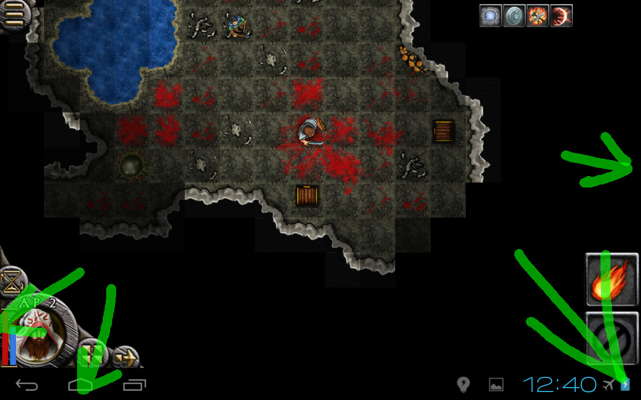
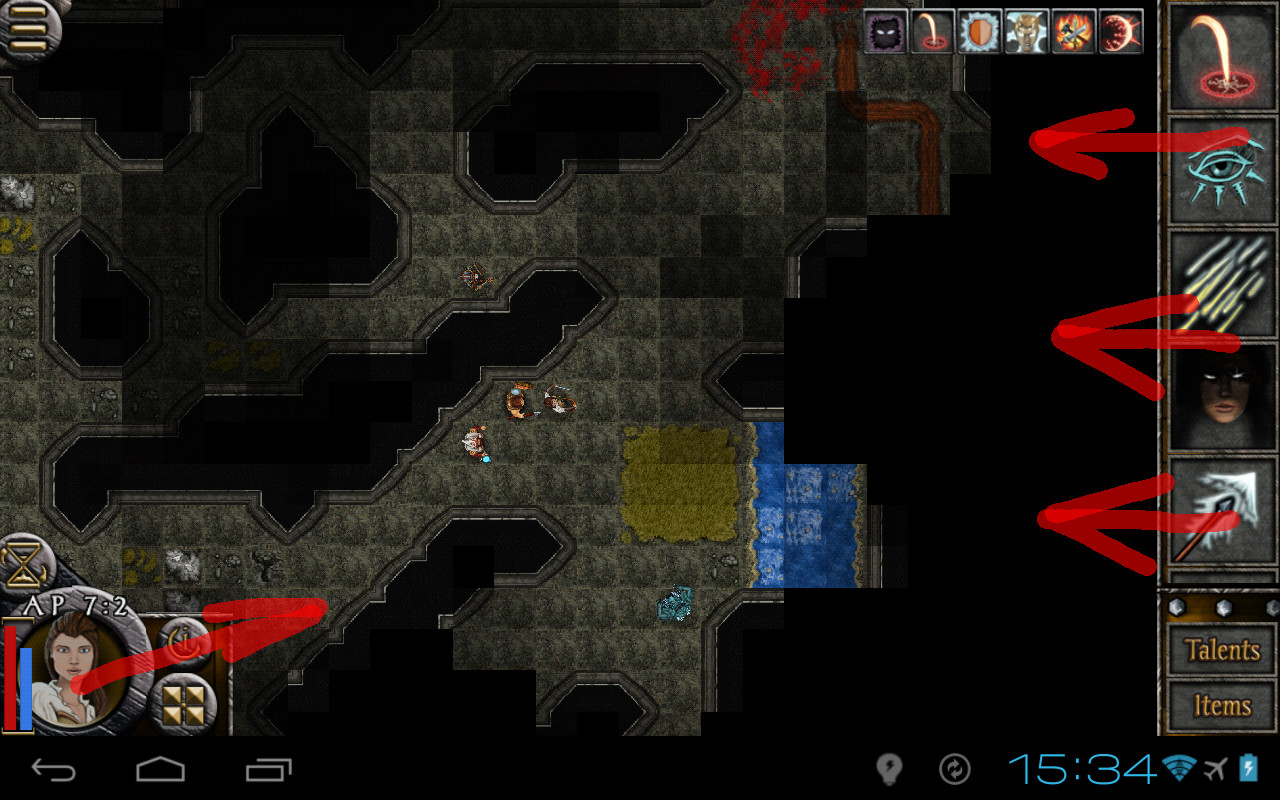
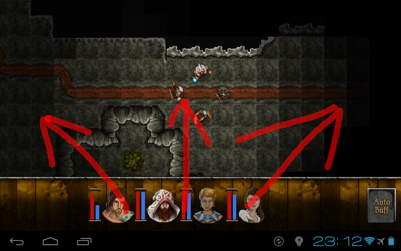
1. Typical old UI, typically getting out of your way as much as possible, and focusing your attention on really important moments.  You don't need to look around the corner or search for what is your current active talent, which is blatantly obvious. 2. Typical new UI.  A diametral opposite of the above. 3. I don't have an incombat screenshot of open party panel >.< But it was about the same size as this, if a little bit higher. But still same general layout. 4. The current party panel.  It literally dominates the screen. You can't pick the character info, you can't send them to next turn… you can't even see their buffs - it just dominates entire screen. Though, I said that already. And the background itself. Just compare the two images and see, which of the backgrounds draw attention away from characters. |
|
|
|
Post by Cory Trese on Oct 14, 2015 16:03:28 GMT -5
Thanks for the feedback! Like fallen said above, the more specific items we can definitely address but the entirely general and vague stuff we cannot hope to make progress against. |
|
|
|
Post by fallen on Oct 14, 2015 18:56:33 GMT -5
anrdaemon - as mentioned on the thread, the character list has been reduced to the minimal size. The new Talent scrolling list and new HUD shape will be not be changing.
|
|
|
|
Post by CdrPlatypus on Oct 15, 2015 2:50:26 GMT -5
Not at all a fan of the wood motif. It doesn't match the look of the rest of the game. Too much sheen doesn't look hand drawn like the rest of the graphics.
|
|
mataeus
Templar
   [ Elite & Star Traders 2 Supporter ]
From summer sands, to armageddons reach.
Posts: 820 
|
Post by mataeus on Oct 15, 2015 6:03:25 GMT -5
anrdaemon - as mentioned on the thread, the character list has been reduced to the minimal size. The new Talent scrolling list and new HUD shape will be not be changing. Not at all a fan of the wood motif. It doesn't match the look of the rest of the game. Too much sheen doesn't look hand drawn like the rest of the graphics. I love the talent scrolling list, it's awesome. It's exactly the kind of polish the UI needed. In fact, the right-hand side of the screen looks fantastic, and does what a great UI should do - improve the UX  I also, in general, love the wooden look when used on a HUD. It's just that, as said above, the two contrasting styles don't match! It looks fine with that bit of studded wood under the scrolling talent list, but the square wooden box jutting out from the right hand side of the stone circle contrasts in style as well as material. Round stone (or steel?) to square wood. I know by this point I'm pretty much flogging a dead horse here, and I don't expect things to change (after all, the majority is pandered to - you make money by selling to the masses, not the few). I'm prepared in advance for Cory Trese's characteristically defensive stance (I'd be defensive too if the results of my passion (no, not that passion) was being picked apart by the end user), but for me, the HUD or UI or menu or whatever you wish to call it has always been, by far, the weakest link in Trese Brothers' games. Intuitive, uncluttered UIs are key when it comes to mobile strategy games, providing transparent information in places you expect to find it. You don't have a lot of screen inches to play with, and you have to cater for people with digits / pens / styli of all different sizes and levels of usability. When combined with screens of varying resolutions (both pixel and touch), it can cause major headaches. I get that. I understand it, and I appreciate it. It's just that I've found, right from the beginning, TB in-game UIs have always been trial and error for me. Yes, we've come a long way from the scrolling text menus of first generation Star Traders. But look at Cyber Knights - I've played days worth of hours in that game, regulars will know it's my favourite TB game, but I still to this day struggle with the unintuitive / unclear UI design. Now that your games are launching from version 1 with more polish (Tutorials / Libraries from day one, for example), I hope that in future this will include the UI. I'd be happy to beta test just that on it's own. As En1gma alluded to above, I hope this is taken as a desire to help, from a fanatic to my favourite mobile developer. |
|