|
|
Post by fallen on Sept 3, 2015 18:51:21 GMT -5
IIRC, bookworm21 is on iOS and waiting for these very updates! |
|
|
|
Post by Cory Trese on Sept 4, 2015 7:32:20 GMT -5
Right ... we'll, they are submitted and we're waiting on our friends at Apple. Shouldn't be too long until bookworm21 gets the update! |
|
|
|
Post by bookworm21 on Sept 4, 2015 11:35:13 GMT -5
Woop woop!
|
|
|
|
Post by anrdaemon on Sept 4, 2015 16:32:57 GMT -5
While you are doing your "UX push", please consider closing gaps between buttons and near screen borders.
Hitting End Turn and Next Ship is a near impossible task.
|
|
|
|
Post by Cory Trese on Sept 4, 2015 16:35:20 GMT -5
While you are doing your "UX push", please consider closing gaps between buttons and near screen borders. Hitting End Turn and Next Ship is a near impossible task. Great feedback -- but we'll need to know more about your device to be able to take action! What hardware are you using? |
|
|
|
Post by anrdaemon on Sept 4, 2015 18:12:59 GMT -5
There's gaps between every button and a screen edge. I can always tap between, say, "Next ship" button and the screen border and pan map from there nine times in a row. And a tenth time with high (not 100%) probability.
Just make sure the buttons' touch areas have no gaps. It'll solve the prblem.
|
|
|
|
Post by Cory Trese on Sept 4, 2015 18:53:47 GMT -5
There's gaps between every button and a screen edge. I can always tap between, say, "Next ship" button and the screen border and pan map from there nine times in a row. And a tenth time with high (not 100%) probability. Just make sure the buttons' touch areas have no gaps. It'll solve the prblem. I ask about the device resolution because it's critically important to determining a fix for it. If you don't want to share, that is OK -- I can guess randomly and try my best! Details make it easier to fix and prioritize all the inputs and feedback across the scant hours we have. |
|
|
|
Post by anrdaemon on Sept 4, 2015 22:51:56 GMT -5
Sorry, I missed the inquiry about device resolution.
It's 1280x800.
|
|
|
|
Post by elwoodps on Sept 9, 2015 6:50:00 GMT -5
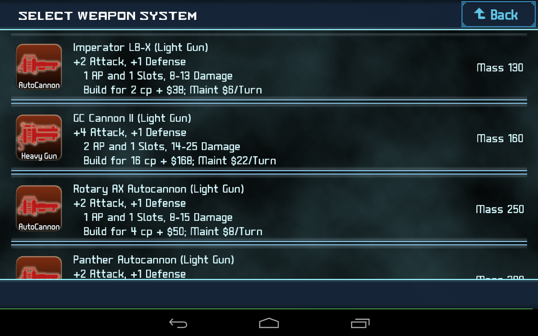
 The " LIGHT GUN" in the " GC CANNON II [LIGHT GUN]" line indicates the type of ship that it can be mounted on, while that " Heavy Gun" logo is stuck on all the LIGHT GUNs that burn 2ap, differentiating them from all other LIGHT GUNs which burn only 1ap and get the " AutoCannon" logo. This confused me a bit when I first started playing, but once I figured it out I just took it for granted until anrdaemon pointed out the disconnect in the Screenshot Thread earlier today. I think it would be less confusing for new players, and therefore improve their experience, if the logo for the 2ap LIGHT GUNs was renamed Light Cannon. |
|
|
|
Post by SyndicateZealot on Sept 9, 2015 17:02:56 GMT -5
A way to upgrade all of your buildings at once. I hate having to continually tap my screen, trying to upgrade all of my hab units...
|
|
|
|
Post by Cory Trese on Sept 9, 2015 22:11:48 GMT -5
A way to upgrade all of your buildings at once. I hate having to continually tap my screen, trying to upgrade all of my hab units... That's on the list, a ways down due to cost but it is something I want to fix! |
|
|
|
Post by En1gma on Sept 11, 2015 15:14:32 GMT -5
I would suggest changing the button when you select a Tech to Research.
ATM the button to confirm your research directive reads 'Buy', and I would consider changing this to 'Research', or 'Confirm Research' (if possible), as the word 'buy' makes me think I can just spend something to get it.
|
|
|
|
Post by anrdaemon on Sept 11, 2015 21:10:49 GMT -5
"Start" ?
|
|
|
|
Post by Cory Trese on Sept 13, 2015 17:18:22 GMT -5
"Research" is the closest match to the other screens. I'll get with fallen and see if the text will fit on the button. |
|
|
|
Post by bookworm21 on Sept 15, 2015 17:50:59 GMT -5
Maybe 'Begin' or 'start' or something similar
|
|